Image


Fast, affordable Internet access for all.
Last August, we launched the first version of our Affordable Connectivity Program dashboard. The goal was to take the confusing and inaccessible federal data on program penetration, signups, and use, and create a tool useful for local governments, policymakers, and broadband advocates working to bring the monthly $30 service benefit to as many households as possible.
Now, two versions later, we're back with a 2.0 version of the dashboard. It still tracks everything it did before (state- and county-level enrollment, wireline versus mobile use, a predictive model, and more), with one important revision and one new addition.
Visit acpdashboard.com, or click here to see the dashboard.
First, we've reworked the methodology we use to calculate how many households are eligible and taking advantage of the benefit. Because families can qualify in a number of ways (and families who qualify one way often, but not always, qualify in one or more other ways), we've used microdata from the American Community Survey (ACS) (5 yr, 2017 - 2021) to calculate eligibility. In addition, we've added an adjustment factor to account for the ratio of the income-only eligible enrollment rate to the income + program eligible enrollment rate. By incorporating the ACS microdata and the adjustment factor, we can much more faithfully account for the total number of households who are eligible; by matching it against our existing zip-code level dataset, we have what we believe is the most nuanced and comprehensive picture of ACP enrollment in the nation.
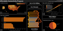
At present, 31 percent of 52.2 million eligible households use the Affordable Connectivity Program benefit.
This, as well as many more months of new data, has allowed us to refine our predictive model calculating how long it will be until the fund is exhausted - sometime between April and September of 2024. If no new households sign up, the fund will last until September. If enrollment growth continues along the same path it has over the last ~9 months, the fund will run out as early as April, when only 51 percent of eligible households have enrolled. Absent additional Congressional appropriated to fill the fund back up, millions of households will see their Internet bills jumped significantly, which will no doubt lead many to cancel their home subscription.
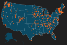
Secondly, in response to many requests, we've added a mobile version of the dashboard as well as a Congressional District-level map. Currently, the district map shows how many households are eligible in each district across the United States, in comparison to how many households are using the benefit. Selecting a district also displays the hyperlink for users to find and contact their representative. In the near future, we will add historical spending to this map, so users can see how much of the fund has been spent so far.
We hope you continue to find this useful and, as always, please share your questions, comments, and feature requests with Research Team Lead Ry Marcattilio, at ry@ilsr.org.