Image


Fast, affordable Internet access for all.
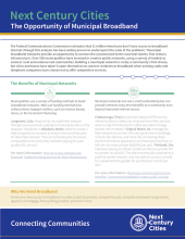
Next Century Cities (NCC) helps communities across the U.S. connect to each other, find resources, and discover ways to improve local Internet access options. The organization has released valuable tools and resources to that aim, including their most recent fact sheet, The Opportunity of Municipal Broadband.
Download the fact sheet from NCC here.
Benefits
NCC’s fact sheet uses examples from municipal network history. Communities have invested in publicly owned fiber optic infrastructure to obtain better connectivity and to reduce telecommunications costs for municipal facilities. In more than a few places, those investments became the foundation for what later became networks to serve local businesses and residences.
NCC’s fact sheet looks at the long-term value of investment versus long-term savings. In addition to faster, more reliable connectivity, residents who chose slight tax increases to fund the investments still came out ahead — overall, paying less for better service from their publicly owned network than they had from poor quality DSL service.
The fact sheet also delves into other benefits, such as economic development, improved efficiency of other utilities, and accountability. NCC uses specific examples from places such as Ammon, Idaho; Longmont, Colorado; and Clarksville, Tennessee. With so many communities served in some fashion by a municipal network — approximately 500 — finding examples isn’t difficult; choosing which to include on a fact sheet is the challenge.
Moving Past the Roadblocks
As NCC notes, some states still prevent local communities from investing in infrastructure to develop municipal networks. Whether de facto or outright bans, these harmful barriers serve no purpose other than to maintain monopolies for the existing national ISPs. The results are detrimental for residents and businesses that need better connectivity and competiton.
As broadband continues to become integrated into more aspects of life, researchers will find new ways to study and document the effects on modern society. The National Digital Inclusion Alliance (NDIA), in partnership with the Brookings Institution’s Metropolitan Policy Program, recently created a searchable database of resources to help those seeking information on issues related to digital inclusion. The Broadband Research Base is ready to assist researchers, advocates, and community leaders.
Organizing the References
According to the NDIA, the collection went live in mid-August and already contains more than 70 reports, studies, and journal articles that “address the impact of broadband and digital inclusion on community and individual well-being.” The tool is an ever-growing resource and the creators are accepting suggestions to help expand the database.
Users can search the Broadband Research Base to find desired documents by several methods, including title, keyword, broad category, and more specific subcategory. Tags can also help users discover what they’re looking for and each reference has a link to the source.
Check out this excellent tool from the NDIA and the Brookings Institution and help find more excellent resources to add to the Broadband Research Base. Submit your organization's work and grow the database to help share knowledge about broadband and its impact on society.
For community leaders, advocates, and researchers who follow broadband policy, trying to stay up-to-date on the many variations of state policy across the U.S. is a daunting task. As approaches change, the work becomes more complicated. Now, the Pew Charitable Trusts has launched a new tool that helps keep all that information sorted and accessible — the State Broadband Policy Explorer. Manager of the Broadband Research Initiative at Pew Charitable Trusts Kathryn de Wit sits down with Christopher to talk about the tool for this week's podcast.
Kathryn describes some of the challenges and discoveries her team encountered while developing the tool. She talks about the wide variations her team documented, especially in definitions, and their determination that those variations rely on who in each state determines which definitions will be used.
While working on the State Broadband Policy Explorer, Kathryn and her team were surprised to learn that, contrary to popular reporting, not as many states have established official offices of broadband deployment as they had expected. She shares commonalities between states that they found surprising while she and Christopher ponder some of the many ways the tool may be used moving forward.
We've already bookmarked this valuable tool.
Check out the State Broadband Policy Explorer for yourself here.
This show is 27 minutes long and can be played on this page or via Apple Podcasts or the tool of your choice using this feed.
Transcript below.
We want your feedback and suggestions for the show-please e-mail us or leave a comment below.
Listen to other episodes here or view all episodes in our index. See other podcasts from the Institute for Local Self-Reliance here.
Thanks to Arne Huseby for the music. The song is Warm Duck Shuffle and is licensed under a Creative Commons Attribution (3.0) license.
In July, the Community Affairs Department of the Federal Reserve Bank of Kansas City released Disconnected: Seven Lessons on Fixing the Digital Divide, a report that touches on Internet access, adoption, and affordability. Overall, this is an insightful primer on the digital divide and how banks can help.
The CRA and the Digital Divide
Banks have a responsibility to invest in disadvantaged communities under the Community Reinvestment Act. The report broadly outlines the state of high-speed Internet access, including the differences between rural and urban access problems, and explains why the digital divide remains so persistent.
Part of the problem is that our data on Internet access and adoption is woefully lacking. The report includes a section on how FCC data overstates coverage and compares it to the ways Microsoft has attempted to verify actual home Internet connections:
“The FCC’s data measure availability of broadband while the Microsoft data measure broadband usage. The company shared its analysis with the FCC, which is looking at how it might improve its broadband measurements. While the FCC says 24.7 million Americans lack access to broadband, Microsoft found the actual number was 162.8 million.” (P. 26)
Another related problem that the report identifies is that the technology needed for high-speed Internet access seems to be constantly changing. Companies do not continue to invest consistently in rural or low- and middle- income communities, leaving both with last-generation networks. At the Institute for Local Self-Reliance, we've learned from years of research that fiber connectivity has the ability to meet current and future needs.
Closing the Digital Divide
Expanding high-speed Internet access can expand access to banking. The report notes that:
“Among low-income households, research by the Federal Reserve Bank of Kansas City shows that lacking Internet access has a higher correlation to being unbanked than a variety of other characteristics, including employment status and race.” (P. 11)
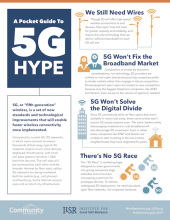
It’s difficult to separate 5G fantasy from reality as reported in traditional news sources. Misunderstandings surrounding the demands and capabilities of 5G has snowballed, creating an incorrect assumption that the technology will solve America’s many connectivity problems. It’s true that 5G is an improvement, but it has limitations. In A Pocket Guide to 5G Hype, we address the most repeated errors surrounding 5G and explain why the technology should be considered another tool, not an exclusive remedy.
Download A Pocket Guide to 5G Hype [PDF] here.
Mistakes We Hear Over...and Over...and Over
Regardless of the source, several errors seem to be repeated and we address those in the fact sheet. We provide context to:
Orders, Complements, and More
The fact sheet also provides information about the FCC’s 2018 Order that interferes with local communities’ ability to control negotiations with 5G carriers. By choosing big telecom companies over local governments the FCC is preventing cities and counties from finding efficient paths to digital equity.
Our Pocket Guide to 5G Hype lays out a comparison between 5G and Fiber-to-the-Home (FTTH). Rather than replacing fiber with 5G, the two technologies can have the most impact when they work together; on the fact sheet, we've laid out the reasons in a side-by-side chart.
We want you to delve deeper into the issue of 5G and find out the truth, rather than get lost in the hype and we've offered a few additional resources to get you started on your own research. Share the fact sheet with others who are interested in the truth about 5G and be sure to send it to your local elected officials. As they create local policies affecting 5G deployment in your community, they need to base their decisions on realities, not hype.
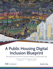
Local communities continue to search for ways to tackle the digital divide and in San Francisco, the city is making strides by working with a local Internet access company. The City by the Bay and ISP Monkeybrains have adopted a new model to bring high-quality connectivity to residents in public housing. The approach not only creates new opportunities for people who were once denied economic and educational opportunities, but does so in a way that is financially self-sustaining. With modest maintenance and start-up costs, Monkeybrains and San Francisco has found a way to bring the same high-speed Internet access to low-income households at an affordable rate. Read our new report, A Public Housing Digital Inclusion Blueprint: Monkeybrains and San Francisco Deliver a Sustainable Gig, to learn how the partners found a way to shrink the digital divide in public housing facilities.
Download A Public Housing Digital Inclusion Blueprint: Monkeybrains and San Francisco Deliver a Sustainable Gig [pdf], here.
Lessons for More Communities
Every community, regardless of population, must contend with digital inequity. As local communities continue to recognize all residents’ need for high-quality Internet access, models such as the approach developed by Monkeybrains and San Francisco spark further innovation.
From Christopher:
“These households need Internet access to search for jobs, improve their education, access government services, and for many other reasons common to modern living. Monkeybrains' work in San Francisco shows how smart one time investments in public housing can guarantee high-quality access to all in public housing.”

If you believe that publicly owned Internet networks are one of the tools that can help in efforts to expand fast, affordable, reliable connectivity to people in your state, and you want to share your thoughts with elected officials, use this language to get started. There may not be a project being developed in your area or a specific bill that you support, but you know that you want decision makers to vote favorably on measures that advance policies and financially support local authority and communities’ efforts to improve local connectivity through publicly owned broadband infrastructure. We’ve created a brief constituent letter/email that you can use to get started in drafting correspondence to state and federal lawmakers that convey your support for publicly owned Internet networks and local authority.
Keep It Simple, Keep It Effective
State and federal legislators typically serve on multiple committees and, as a result, their time spent on each issue is often limited. In order to encourage them to digest your full letter, stating your thoughts in a brief letter or email is often the most effective. Being direct, polite, and supportive goes along way with Representatives, Senators, and their staff.
You can include examples from your own state or from other places to help politicians and their staff learn more about the advantages of community broadband networks. Large national Internet access companies spend millions each year to employ lobbyists who spread negative misinformation about publicly owned broadband networks. You can help balance those efforts by sharing some of the positive results. Use our Municipal FTTH Networks page, the Economic Development page, search a specific state on MuniNetworks.org, or click on one of the pins on the Community Network Map to find a sample network.
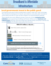
Local governments spend billions on all sorts of infrastructure every year to advance the public good for their communities. Roads and bridges keep day-to-day activity moving. Investments such as water and sewer infrastructure keep cities clean and livable. Fiber infrastructure is used for a wide range of purposes, including economic development, education, and to keep a city’s administration connected. To get a look at how fiber network infrastructure compares to other public investments, we've developed the Broadband is Affordable Infrastructure fact sheet.
Side-by-Side Comparisons
The fact sheet looks at investments in both larger and smaller cities. Each of the projects that we compared to fiber optic networks required similar local investment and contributed to the well-being of the communities where they were developed. The fact sheet offers a snapshot of cost, how the projects were funded, and the results.
Some of the projects we compared are located in Wilson, North Carolina; Lafayette, Louisiana; and Chattanooga, Tennessee, where the networks have been in place long enough to bring economic benefit and other public benefits.
We found that:
Communities invest in a wide range of infrastructure projects. Fiber optic networks fit well within the historic role of municipal investment to improve the business climate and quality of life, and are often lower cost when compared with other essential infrastructure.
This fact sheet helps illustrate how high-speed networks are public infrastructure and it helps with a visual of how that infrastructure stacks up compared to traditional forms of municipal investment. Share this resource with city managers, city council members, mayors, and other elected officials. The fact sheet will also help when discussing municipal investment with other people interested in how to improve local connectivity.
On January 16th, Next Century Cities (NCC) launched a resource that will help communities of all sizes prepare themselves for the future. NCC's Becoming Broadband Ready: A Toolkit for Communities combines best practices and experiences from places across the country to assist local communities as they begin broadband projects.
Ready, Set, Launch
In order to celebrate the new resource, learn about the content, and discover how the toolkit can be relevant to a range of projects, NCC hosted a launch event on January 16th. In addition to providing a demonstration that revealed the ease of using the toolkit, NCC brought community leaders to the event for a panel discussion. Dr. Robert Wack from Westminster, Maryland; Dan Patten from MINET in Oregon; and McClain Bryant Macklin from Kansas City participated on the panel hosted by ILSR’s Christopher Mitchell.
Panelists discussed the unique challenges they had encountered in their communities and how they overcame them along with the ways they addressed those challenges. In addition to issues that surrounded how they educated the community, panelists also talked about matters that influenced their choices of model, financial problems, and other issues. Below, you can watch the panel discussion, which include conversation on collaboration, information sharing, and other matters.
The Toolkit
Becoming Broadband Ready: A Toolkit for Communities is a comprehensive resource that covers considerations from early in the process to determining success throughout implementation. In addition to offering guidance with examples from across the country, the toolkit offers links to other resources, such as model ordinances, reports, podcasts, and organizations laser-focused on specific and relevant issues.
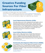
As interest in publicly owned broadband network infrastructure increases, local communities seek out new ways to fund municipal networks. Revenue bonds, interdepartmental loans, and avoided costs have been the three most common methods for funding Internet network infrastructure, but local leaders are finding creative approaches to get the job done. The Creative Funding Sources For Fiber Infrastructure fact sheet presents new approaches, pros and cons, and provides examples for further study.
New Approach to an Ongoing Challenge
Communities that need better connectivity must consider numerous factors when fiber optic network infrastructure is on the table. In addition to the type of model that’s most appropriate, decisions include vendor selection, and the extent of the network footprint. A critical element to every community network are the choice of funding mechanisms local leaders choose to see the project from idea to implementation.
Communities such as Ammon, Idaho, and Kitsap County in Washington are using fresh ideas to fund their infrastructure development. In this fact sheet we describe the way these new mechanisms work and lay out some benefits along with some potentially negative implications. It’s important that communities take a frank look at all the possible repercussions as they move forward.
This fact sheet will help your own creative funding ideas flow as you look for ways to finance your community’s high-quality Internet access project.